HiperLine Case Study
Branding a Sewer Company: New Logo and Website for Hiperline
How do you make a sewer company look good? You dig deep to learn all about wastewater treatment and why your clients are so passionate about their work. That’s just what we did during our recent project with Hiperline (formerly R&H painting).
Backstory
Hiperline is owned and operated by the three Raisanen brothers, Grant, Greg, and Bryce. Back in 1974, their father started R&H painting, a commercial painting company for industrial applications.
But in 2017, they decided to move their focus solely to providing high-performance linings for wastewater structures after one of the brothers was inspired by a conversation with a Sherwin Williams employee. She had asked if the brothers provided painting services for wastewater systems. Curious about this service, the brothers got to work. After ample research, they found SpectraShield and decided this should be their new business.
The company would begin targeting city administrators, public works directors, and city engineers. After beginning the company, the brothers quickly realized they needed assistance creating a new professional identity.

The Scope
New Name
Logo Design
Messaging
Web Design & Development
Business Cards & Brochure Design
Challenges
Make a sewer lining business look good
Rebrand a painting company that started in the 1970s
Break the news about a $3,500+ domain name
Approach
We met with Bryce to listen to the company’s story and understand exactly what they were going after with this new business niche. It became clear that they needed “the works” including a new name, logo, website, and collateral.
We began by rolling up our sleeves and digging into research. We learned all about the wastewater treatment process and the different terminology that is used. With our new-found knowledge, we began brainstorming for possible names. Expo marker in hand, the team got to work concocting new ideas that fit the criteria. The new name had to be easy to say, remember, and reflect the values of the business.
After working through many concepts, the team finally landed the perfect one, “Hiperline.” Based on the words high-performance linings, this name checked all of our boxes. Stoked, we went looking for the domain. Our hearts sunk. Hiperline.com was taken. We went back to the Raisanen brothers and told them the bad news. When looking for other alternatives, Matthew found that Hiperline.com was back on the market. Yes!…… For $3500. Our hearts sank yet again. But when we told the brothers about this bittersweet news, they were committed. “We’ll buy it!” they said.
After that, we were able to get to work on the logo and website.

Logo
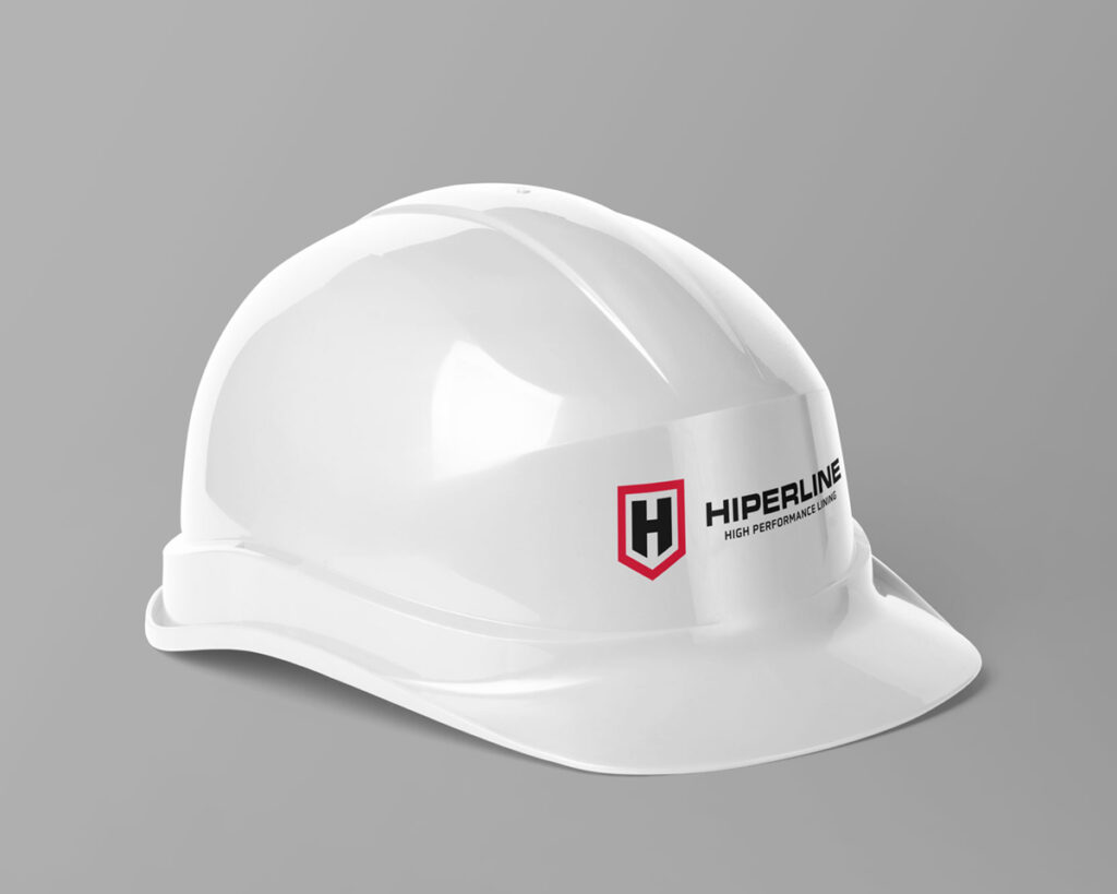
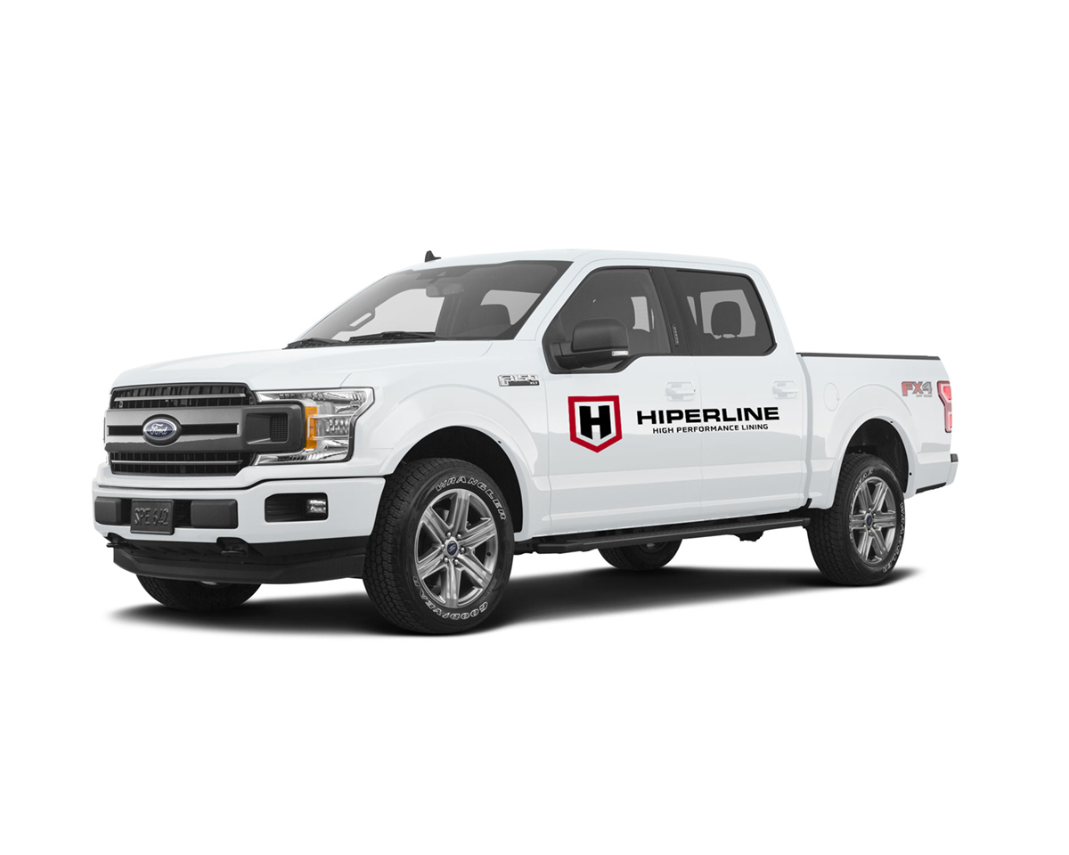
After securing a name and domain, the team got to work on the logo. The Raisanen brothers wanted a recognizable logo with high contrast and sharp lines. We knew it would have to be bold, professional, memorable, and stand out on the side of their trucks. After working through several concepts, we created a logo that met the client’s requests and represented the nature of the business. For the mark, an H is encircled by a shield shape, indicating the protection given by the lining used to coat the wastewater system. The logo also strongly features the new name in order to build brand recognition.

Website
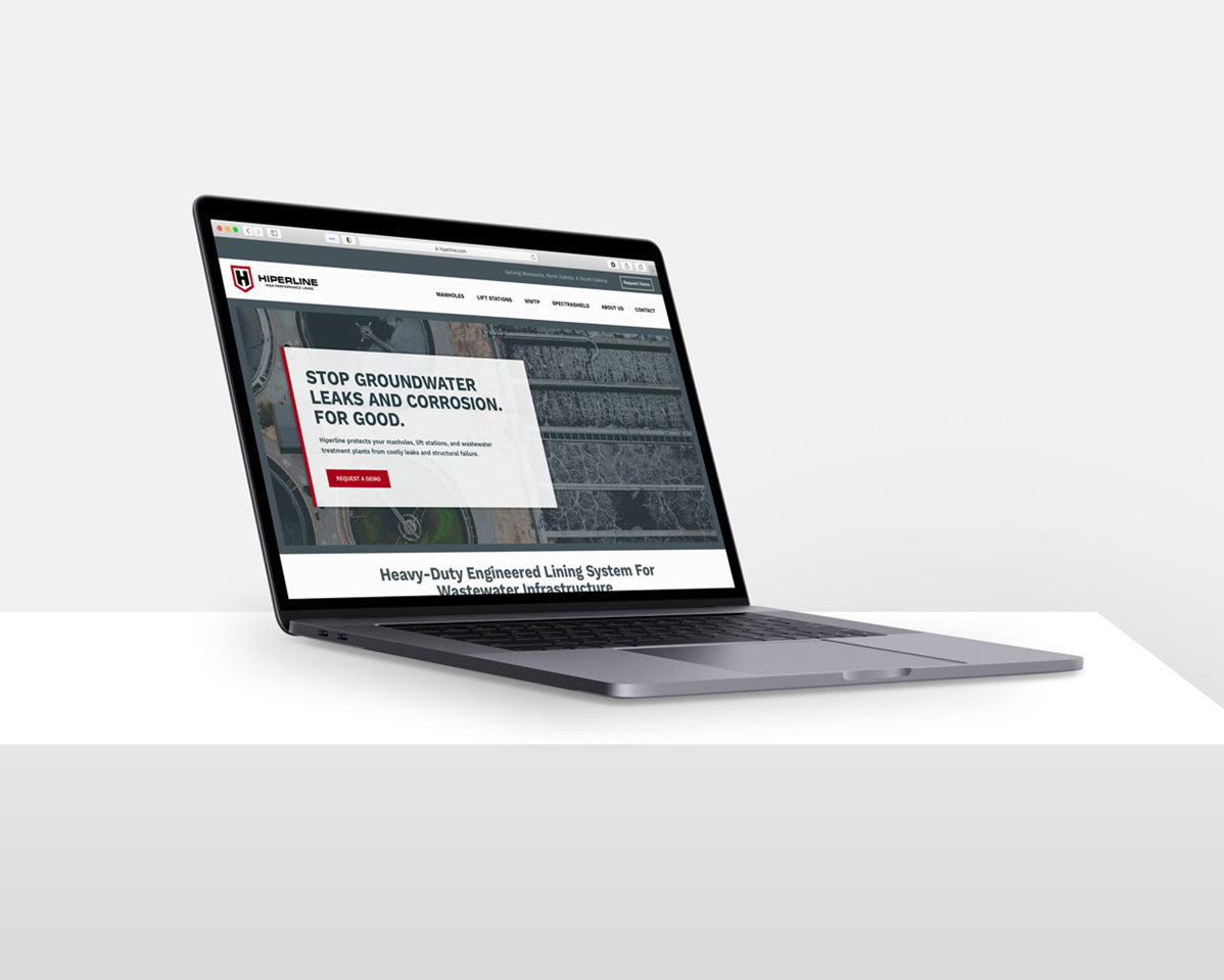
From there we moved on to designing a professional website—the final corner piece in making Hiperline a strong, memorable, good-looking brand. We began with a site strategy, mapping out where the content would go, and how the prospective customer would move through the site. New messaging was written for all pages of the site before we began building a home page, header, and footer design.
After the design was approved by the client, we built out the internal page design, creating a cohesive look and incorporating the brand elements to form a strong identity. The website was also created to meet all of the current web standards such as responsive layout and security.
The Results
Prior to the launch of the website, Bryce Raisanen noted that there was already a mindset shift around the office. The employees were engaged with the new brand and excited to show it off. Once the site was launched, we designed new Hiperline business cards and a brochure for their team to hand out at trade shows and demos.
The company is now able to put their best foot forward as they start down this new wastewater lining path. They are easily recognized and connected with a strong brand. Their mobile-friendly website can help any prospective customer learn more about the process, who the owners are, and easily reach out for a demo or pricing.


